TABLE OF CONTENTS
Are you looking for a way to improve the usability of your form design, reduce user errors, and increase the speed at which people can fill out a form? One of the most reliable UX techniques is to employ progressive disclosure to mask complexity. While it introduces more clicks, it can actually speed up the process of filling out a form.
At Recurly, we have the challenge of designing an easy-to-use interface for an application that is enormously powerful and allows for many different use cases. Our application logic is able to recover a huge portion of revenue most businesses lose to credit card declines. A big reason our business is growing like crazy is because we’re solving a really hard problem for any business that runs on subscriptions. The UX team at Recurly has the interesting challenge of exposing this power to our users while staving off choice paralysis.
Forms are the primary touchpoint between your company and its customers, yet they don’t often get as much design attention as they deserve. It’s a shame to spend an immense amount of time, money, and attention directing customers into your sales funnel, only to lose them to lengthy and confusing forms.
There’s a reason form design often gets overlooked. Form usability can be very difficult to test for because the internet (especially the internet of the 90’s and early aughts) has trained people to have a high tolerance for horrible forms. Traditional data-driven analytics can be misleading too: a successful form completion with no validation errors doesn’t necessarily mean it was easy for the user to fill out.
Paradox of Choice
When confronted with an array of available actions, users can become paralyzed. A large number of choices increases the cognitive energy required to discover the best course of action (as popularized in the famous jam study conducted by Sheena Iyengar). This principle holds especially true when filling out a complex form.

Interface designers constantly wrestle with the tension between making tools easy, and making tools powerful. The right way to resolve this tension depends entirely on the audience, their goals, and their environment (in other words, the user’s context). Designing for a multi-faceted audience often results in the natural reaction to add more actions, more configuration options, and more explanatory messaging—even though we know users rarely read more than 20% of the text on a web page.
Progressive Enhancement Doesn’t Really Solve the Problem
Progressive enhancement / reduction—which is the practice of building different “flavors” of UI complexity to suit different skill levels—can really help your users get more out of an interface. It’s a fantastic tool to save time and clicks for the power-user who has the time to learn new ways of interacting with an application. However, it doesn’t solve for users who are short on time or have more modest technical skills. We still need a way to empower these users without paralyzing them with complexity.
Progressive Disclosure to the Rescue
Progressive disclosure is the practice of masking complexity in a user interface. Steve Krug’s famous book on web usability, Don’t Make Me Think, states that users don’t mind the number of times they need to click to complete an action, as long as those clicks are obvious and mindless.

A Step in the Right Direction
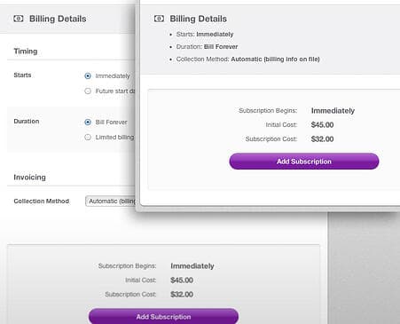
One area where we’ve been able to employ progressive disclosure at Recurly is on the New Subscription Page. This page allows a business owner to easily apply a subscription plan to a subscriber’s account, customize their add-ons, and specify exactly when and for how long that subscription should be active.
As our engineers began to expose more control in the UI, it became apparent that there was far too much complexity to be able to use this feature in a rapid way (without requiring our users to employ significant brain power). At the same time, removing functionality wasn’t an option since the controls we provide are essential to the running of a subscription-based business.
After interviewing our customers, we discovered that although everyone needed all of these features, they didn’t need all the features all the time. We identified the elements that users would need ~80% of the time, and hid the rest.

Give Your Users a Cue
Any time you mask important functionality, it’s very important to give your users a cue that they can still access that functionality. One of our engineers came up with a brilliant solution to surface the masked functionality.
When the hidden features are expanded, everything looks normal. When they are contracted, we show a short preview. This preview is sufficient to give our users confidence that the default values are correct without having to visually process several additional controls, and it’s an obvious click to change the defaults.

The Right Information at the Right Time
Progressive disclosure isn’t always just about masking complexity. Sometimes it means disclosing the right information, exactly when the user needs it. For instance, we added a confirmation block right next to the submit button so our users can click with confidence. A “submit” action on this particular feature charges a customer money, so it’s very important that there are no mistakes. Since this mental “double check” must happen before submitting, we made it easier by showing our users exactly what they need, where they need it, and no more.

Show Less, Provide More
Many of the “less is more” arguments sound great, and the sentiment comes from the right place. However, the reality is that some tools need to provide a lot of functionality in order to really solve a customer’s problem. In cases where you can’t remove complexity, try masking it. Progressive disclosure gives you the best of both worlds by showing less, but providing more.

