March 15, 2015
If You Only Knew - How Much Your Relative Churn Rate Matters

TABLE OF CONTENTS
TOPICS


Churn is one of the most sensitive variables impacting the value of a subscription business. Your business is in a "drag race" with competitors to come out on top. How your churn rate differs from your competitors' can tell you a lot about the relative health of your business and theirs.
Annuity revenue streams are made more or less attractive by the speed with which they ‘decay’. In the world of SaaS and other subscription models, this ‘decay’ is a powerful reflection of how well you are delivering a service that satisfies your customers over a period of time. Deliver a great product or service and your customers will stick around. If you don’t deliver, your customers leave, and your business becomes less efficient.
Churn is a summary health indicator
Focusing on subscriber churn alone is like studying the emissions from the tailpipe of your car. Churn tells you when there's a problem, but you need to look farther up in the system to figure out the source.
When you look for the source of a problem, you're likely to be reminded that it's better products, services, and experiences that capture the loyalty and share of wallet of customers over time.
Churn rates provide a brutal indicator of the sum total of all of these important elements. You can monitor your churn rate for signs as to how well your company is delivering value over time. Monitoring your churn rate can help you fix all kinds of problems with your business.
However, it's important to always maintain a healthy dose of paranoia and ask yourself NOT just how well your own company is performing on a period over period basis against ‘yourself’. More importantly, you need to ask how well your company is performing against your competitors. Ultimately, you’re drag racing with the companies that you compete with. In this drag race, your relative/competitive churn rate is a matter of life or death.
"Think of relative/competitive churn
as a matter of life or death"
Here at Recurly, we observe churn characteristics for thousands of companies and see many interesting characteristics emerge. For this post, we’re going to focus on two real companies which are competing head-to-head in the same market for the same customers.
This is a ‘drag race’ between two similar companies
We’ll focus on churn as the predictive indicator of the outcome.

Company A’s cohort-based churn profile is extremely healthy. A quick visual scan highlights the company's ability to retain a healthy proportion of customers over several years. The curves are relatively ‘flat’, meaning 'decay' of customers over time is relatively slow. This relatively long customer lifetime maintains a healthy long-term value (LTV) - the area under the curve - over time.
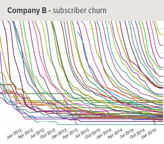
Company B is a different story. Company B has a very steep retention curve in relation to Company A. Company B is providing a service that delivers value over a much shorter period of time, but they have been able to acquire customers at a rate of 2.5X that of Company A.
Here is where the rubber meets the road
We can combine the cohort curves for Company A and Company B into a single representational view for each company and superimpose them. The chart shows the starkly contrasting underlying reality: Company A is able to derive 109% more value from its customers over time.
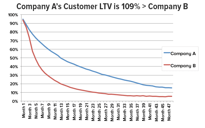
The service offerings of Company A and Company B are priced nearly identically, so their revenues per customer are similar - but Customer A is getting those revenues from their customers for roughly twice as long. This means that Company A can spend over twice as much to acquire customers profitably against their closest competitor. The entire engine of Company A’s enterprise is more efficient - it runs cooler and will last longer, and will certainly be able to ‘fuel up’ with additional capital more easily along the way.
Dan Burkhart - CEO, Recurly
TOPICS