


In a previous blog post, we’ve described the ground-breaking data science work spearheaded by Recurly’s data science team. Since that previous post, we’ve conducted various cutting-edge research projects to address our customers’ needs for data insights. One interesting project uses time series forecasting to predict future subscription volume and MRR (Monthly Recurring Revenue).
Time series forecasting is a data science technique widely used in the business world which attempts to predict future values based on previously observed values. For example, it might predict a merchant’s monthly subscription volume in 12 months’ time by analyzing the past 24 months’ data.
Time series forecasting can be applied to predict many important subscription metrics such as Monthly Recurring Revenue, new customer sign-ups, and monthly churn rate. Better forecasts for these metrics will lead to better business decisions from foreseen trends. Developing monthly forecasts for these metrics is a common practice, but weekly forecasting is also possible, if that’s a better fit for your business.
There are many classical and modern machine learning methods available for time series forecasting. In this project, we applied two popular methods ARIMA and FBProphet.
In this post, we’ll share the key model results and learnings from our forecasting project. The time series model’s algorithms and parameter-tuning discussions are also included in the second half of this post for those interested in learning more about them.
Key Model Results and Learnings
We built our forecasting models to predict monthly/weekly MRR and subscription volume for a list of B2B/B2C merchants in various industries: Consumer & Business Services, Consumer Goods & E-Commerce, OTT, Publishing & Entertainment, and SaaS/Cloud Computing.
Very accurate forecasts, with error rates below 2%, achieved for many merchants.
We compared the model forecast accuracy from the two algorithms ARIMA and FBProphet using future-time-window data. For example, we trained the model using data from Jan. 1, 2017 – Dec. 31, 2018, generated predictions for Jan. 1, 2019 – Sept. 30, 2019, and compared the forecasts with the actuals.
The forecast accuracy of the model is very promising. For most data we tested, the MAPE (Mean Absolute Percentage Error between actual and prediction) is less than 5% and even below 2% for many merchants. A two-percent MAPE indicates that over all the time periods predicted, on average the forecast is only off by plus or minus 2% compared to the actual value. The forecast accuracy from ARIMA is on par with FBProphet.
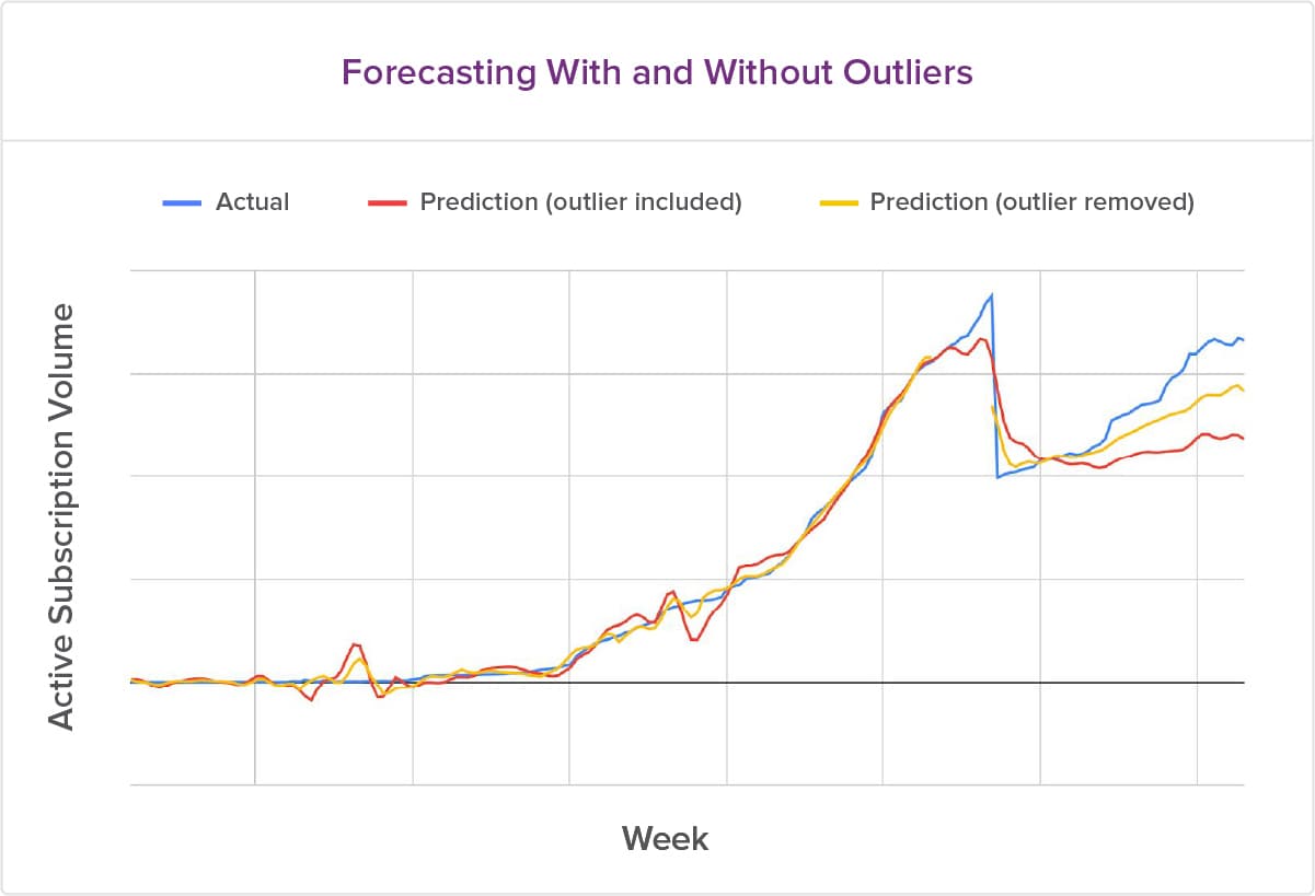
Treating time series data outliers is a good technique that helps with improving forecasting accuracy. This technique generated a 50% lift in MAPE for some merchants.
What is an outlier in time series data? An outlier is a data point that differs significantly from the majority of the observations in the time series. For example, not every month’s subscription volume reflects an overall trend in a merchant’s business. There can be outliers in the data that the forecasting algorithm might pick up, producing inaccurate predictions for the future time periods.
We can remove outliers from the training data when using FBProphet. For ARIMA, there are methods to identify outliers, and to suggest potential replacement values. From our study, we found that removing outliers improved our prediction accuracy, especially when a merchant does not have much data and outliers affected the overall result.
The chart below shows the prediction accuracy with and without outliers.
If you're in a business rather than a technical role, the takeaway for you is that modern time series forecasting models can generate very accurate predictions for subscription metrics like MRR or subscription volume in the future time periods. These accurate forecasts can be leveraged for your business planning.
The fun and rewarding part of any machine learning project is to prove the business value out of the complex mathematical models. For time series forecasting, we are able to demonstrate the accuracy of our forecasts, which gives key decision-makers increased confidence in making business decisions and plans from these forecasts.
A Technical Deep Dive
The rest of this post will talk about time series forecasting model algorithms and parameter-tuning techniques applied in ARIMA and FBProphet. For ARIMA, we’ll introduce the three main components p, d, q and their definitions. We’ll also discuss the methods to identify the most optimal model parameters p, d, q like using ACF and PACF, auto-ARIMA process. For FBProphet, we’ll discuss the four main parameters: Growth, Holidays, Seasonalities, Changepoints. What does each parameter mean? How to tune each parameter?
Let’s look at ARIMA first.
What is ARIMA?
ARIMA (Autoregressive Integrated Moving Average) is one of the most popular and widely used time series forecasting methods. This model is made up of three different components: the Autoregressive component p, the Integrated component d, and the Moving Average component q.
Before we explain these components, let’s understand the meaning of lag. A lag or lagged term means historical data points. Assume we have a monthly time series with data from January 2018 - December 2019. A lag of 3 terms would be a data point three months in the past. So for December 2019, a lag of three means the data for September 2019. A lagged series extends this concept to the entire series. So, if we lag our entire time series data by 3 terms, we will end up with a new time series where the first 3 data points, October 2017 to December 2017, will be empty followed by data from January 2018 - September 2019.
Now, let’s dive into our ARIMA components. We will begin with the integrated component d. An important concept used in time series forecasting is called stationarity. A time series in which the statistical properties like mean (average) and variance do not change over time is said to be ‘stationary.’ However, we know that such a time series is rarely possible in the real world. Things change over time, and we cannot expect data to be stationary over time. But ARIMA works only on stationary data. So how can we make forecasts with a non-stationary time series? This is where the d parameter comes into play. The Integrated component converts our time series from a non-stationary to a stationary one. We do this in two steps: we lag the time series by one period and subtract this lagged series from the original one. This process is called differencing. We keep doing this until the resulting series becomes stationary. How many times we difference to achieve stationarity gives us the value of d.
Next comes the Autoregressive (p) component. This component forecasts future values by using a regression model built with time series historical values. The value of p tells us how many historical values we use. So, an autoregressive (AR) model of value two will use two historical terms.
Finally, the Moving Average (q) component does the same thing as the autoregressive component, but instead of using the time series own lagged values, it uses error terms of a moving average model built on the lagged values. Just like p, the value of q tells us how many lagged error terms we use.
If you’re interested in the math behind these components, there are many online references. We recommend this one.
How do we select ARIMA(p,d,q)?
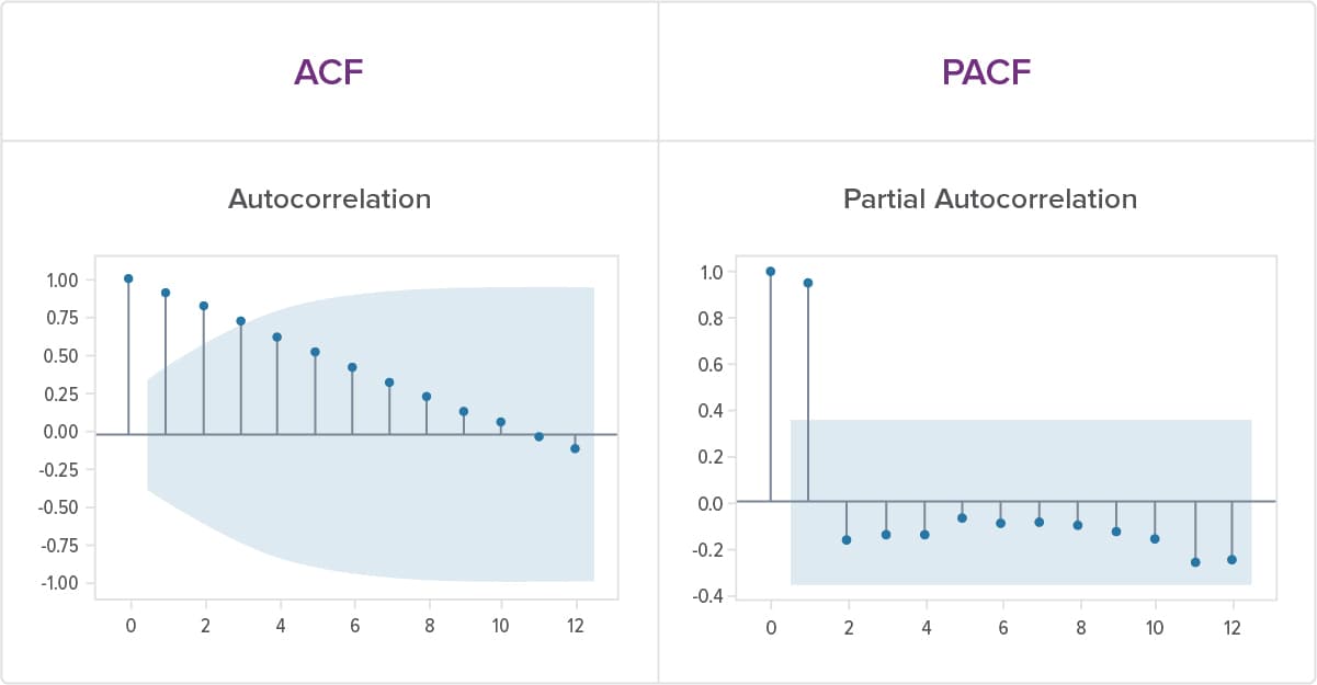
Building a good model requires choosing the correct values for p, d, and q. We can use the autocorrelation function (ACF) and partial autocorrelation function (PACF) plots to identify correct values for p and q. (You can read further about these plots here.)
Both the ACF and PACF plots are bar plots. The ACF plots the correlation of the time series with its lagged values over multiple values of lag. The PACF also plots the correlation of the time series with its lagged values. However, in the PACF, we remove the effect of any correlations that might be caused by previous lagged values. So, for the partial autocorrelation between a time series and its third lag, we will remove the effect of the correlations caused by the first and second lag.
We can plot the ACF and PACF and follow some general guidelines to determine the p and q values using them. Let’s go over some of the basic rules of thumb. A PACF plot where the correlation values suddenly drop off to zero and the ACF plots declines gradually, indicates that our time series is produced from an autoregressive (AR) process. The lag after which the PACF goes to zero is the value of the AR term. On the other hand, a scenario where the ACF plot suddenly drops to zero whereas the PACF plot declines gradually tells us that our time series is generated by a Moving Average (MA) process. The lag after which the ACF sharply cuts to zero is the value of the MA term.
Below are examples of ACF and PACF charts from time series data ARIMA(1,0,0).
It’s important to note that while we have these suggestions, things get more complicated when we have a non-stationary series and/or when our time series has both AR and MA components. It’s almost always better to take advantage of one of several statistical tools (for example auto_arima function in Python) to determine the optimal values of these parameters. These tools go over different combinations for p, d, and q terms and pick the combination that works the best, based on certain statistical properties and metrics. Although we discovered that we couldn’t rely completely on the parameter search results; sometimes we needed to manually try the parameters to improve the model’s accuracy.
Once we have p, d, q values, we can build our model and start making forecasts. Another great characteristic of the ARIMA model is that we can also detect seasonality and include that impact in our model SARIMA (Seasonal ARIMA). All it takes is an additional set of seasonal parameters P, D, and Q. These terms are the exact same as non-seasonal parameters p, d, and q; the only difference is that they are used at the seasonal level.
We hope you have a good understanding of ARIMA thus far. Let’s talk about FBProphet.
What is FBProphet?
FBProphet is a cutting-edge, time series forecasting procedure created by Facebook. It works well with time series that have strong seasonal impacts. FBProphet is robust in handling missing data. It generates forecasts for future time with high accuracy.
How do we tune the FBProphet parameters?
FBProphet is known to be easy to use but difficult to master, especially if you want to gain a deeper understanding of what’s going on with the model. This requires ‘tuning’ the model parameters—like adjusting the knobs on a radio to get the clearest signal. There are four important parameters on the machine that we experimented with: Linear or Logistic Growth, Holidays, Seasonalities, and Changepoints.
Simply put, Linear growth indicates that the trend will follow a straight line, usually going up. Logistic growth means that there is a maximum point somewhere in the graph, and the growth rate will slow down and get smaller as it reaches that maximum. Think about these two different trends in terms of population. Linear growth means that the population will keep on growing forever without limit, while Logistic growth signals that population size will approach some upper bound imposed by limited resources in the environment, for example.
Holidays and Seasonalities are also easy to understand. Holidays signal a period of time each year when specific days have a similar impact year-over-year. For instance, Black Friday and Cyber Monday see a spike in purchases compared to other times of the year.
On the other hand, Seasonalities refer to regular, periodic fluctuations. For instance, the hotel industry has a high season during the summer and a low season in the fall, once school starts. In FBProphet, you can tweak these two parameters to specify the holiday dates and the seasonality (yearly, weekly, daily). By manually tuning this parameter for individual Recurly customers, we can improve the accuracy of the predictions, because individual customers are affected differently by holidays and seasonalities.
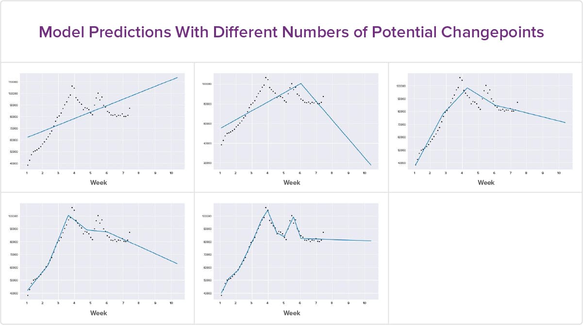
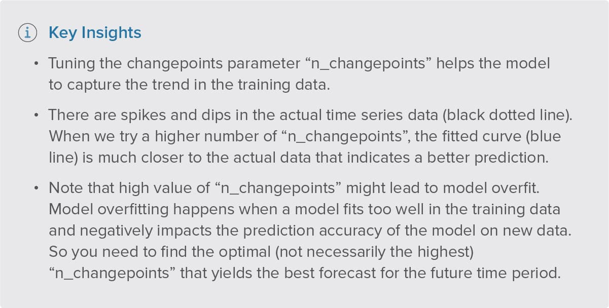
Another set of parameters we’ve tested extensively are Changepoints. Changepoints represent sudden changes in the trajectory of time series data. An example would be an email campaign which results in 100,000 new subscribers over a short period of time. The Changepoint would be the point in time that experiences this noticeable change. We can manually adjust the number of Changepoints in the data or ask the model to do it for us.
The charts below show the fitting curve for different numbers of potential changepoints 0, 1, 3, 4, 10 (ordered left to right, top to bottom).
This post was authored by Danielle Zhu, Haebichan Jung, and Vineet Joshi.
TOPICS