July 2, 2019
How Data Science Work Reveals Hidden Trends in Payment Success Rates


In a previous blog post, we outlined how Recurly uses machine learning in our Revenue Optimization Engine to predict transaction success and maximize your revenue. This unique Recurly technology is an example of how machine learning, if handled correctly, can be a powerful tool for preventing involuntary churn.
At Recurly, we are constantly exploring and experimenting with how machine learning can be used in applications that push the knowledge frontier in the payment space. One specific example is the relationship between the time a transaction is processed and its success rate. From the exploratory data analysis, we found that time of day, day of the week, and even day of the month affect the transaction success rate. Further machine-learning modeling proved that these time-related features are important for the prediction of transaction success and as such can help us to further reduce involuntary churn and increase subscriber retention rates for our customers.
Leveraging Recurly’s data for analytical insights
Our wealth of data enables unique insights into transaction decline rates based on different time groupings -- for example, weekly, monthly, hourly. One way to visualize this relationship is through a heatmap. The graph below illustrates decline rates across various transactions on different days and hours. The time of these transactions have been converted from Coordinated Universal Time (UTC) to the local time of the country of the card-issuing bank (i.e., the customer’s bank). The darker colors indicated higher decline rates.

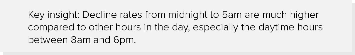
The decline rate differs a lot between day-time and night-time and is much higher from midnight to 5am. This may be because transactions after midnight are seen as more suspicious to banks and payment processors than those undertaken during more expected hours. Increased fraud protection policies at those hours may lead to an increase in declined transactions.
We found a similar trend for decline rates observed at a more granular level for different card types.

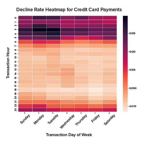
Separating the data this way reveals further insights. Both charts above converge on an overlapping pattern of transactions being rejected during after-work hours.
Decline rates are much lower for debit cards on Fridays. This might be due to paydays often occurring on Fridays, resulting in increased payment solvency. However, credit card payments do not show similar pattern as debit card payments. In fact, the higher decline rates tend to occur on Sundays, Mondays, and Tuesdays for credit card transactions.
Machine learning for next-level data intelligence
At Recurly we do not only conduct exploratory data analysis to discover patterns such as these in online transactions. We also take analysis to the next level by leveraging the predictive powers of statistics and machine learning. This involves computational algorithms that learn patterns from historical data — patterns that are more intricate and varied than the ones examined above. Through the learning phase, these models can then predict the likelihood of success for future transactions with some statistical certainty.
For this blog post, the Data Science team tested data on the CatBoost machine learning algorithm. The model was trained to provide predictions on the likely success and failure of every transaction, using input features like the hour and month of the transaction, the name of the bank, the type and level of credit card, and the type of transaction (initial vs. recurring). We then mounted Shapley Additive Explanation (SHAP) Dependence Contribution Plots on top of the algorithm to arrive at a next-level penetration of data insights.
CatBoost is a new and powerful machine learning algorithm that uses gradient boosting on an ensemble of decision trees. It can handle categorical features automatically, reducing the need to one-hot-encode these features that can bloat dimensionality of data.
The SHAP dependence plot is a very useful visualization technique for demystifying the machine learning black-box models. It visualizes the interaction between two features and how they influence the prediction of a machine learning model.
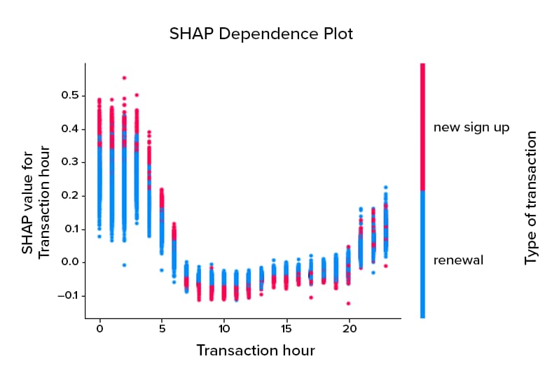
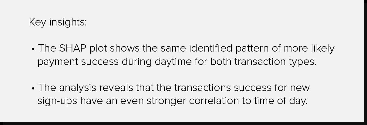
The chart above displays the interaction between the time of day and the type of transaction in model prediction. Starting with the shape of the graph, each dot represents one transaction in the model training data. The red dots represent new sign up transactions while the blue ones indicate recurring ones. The vertical, y-axis line on the left side illustrates how these individual dots contribute to the prediction of the machine-learning model. The higher the value above the 0.0 mark, the more these individual transactions influence the model to predict a transaction decline. The lower the value, the more these transactions influence a prediction of success.
Note how both blue and red dots trend downward from 7am to 8pm and then move upward. The curvature implies that the model is highly likely to predict failure for transactions processed from midnight to 6am. This prediction parallels the heatmap findings.
Let’s further look at the different SHAP values for the blue and red dots at each individual transaction hour. From midnight to 6am, new sign-up transactions influence the model’s likelihood to predict transaction failure much stronger than renewal transactions. From 7am to 8pm, the trend changes, and new sign-ups slightly influence the model’s likelihood to predict transaction success. Renewals on the other hand have little to no impact on model output during this time (SHAP value close to 0.0).
Visualization techniques reveal hidden relationships
In this study, we used heatmaps and SHAP plots for our data analysis. By leveraging these visualization techniques, we were able to unveil the hidden relationships between the time of a transaction and its success rate. Be on the lookout for additional research results, as we experiment with new visualization tools and machine learning algorithms for other interesting trends in the payment domain!