Design and User Experience has always been a critical component at Recurly, and for the Product Design Team, 2017 was all about making the way we work more effective. From new tools and improved processes to collaborating with non-designers and learning more about user needs, we spent the year improving our ability to create great experiences for our users — from the finance whiz and customer support rep to the subscriber receiving an invoice.
Good Things Come From Collaboration
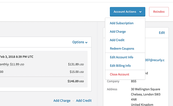
Working closely with our support team, we improved several experiences in Recurly, such as the “Actions” drop-down menu on account and invoice pages, which provides shortcuts to important actions on the page.
Show and Tell
We’re really excited about several new tools that we implemented last year which allow us to learn more about how features are used, identify pain points, and provide in-app messaging and walkthroughs. You may have already noticed some of our announcements, and guided walkthroughs will be coming soon.
Design, Test, Refine, Repeat
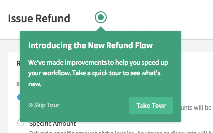
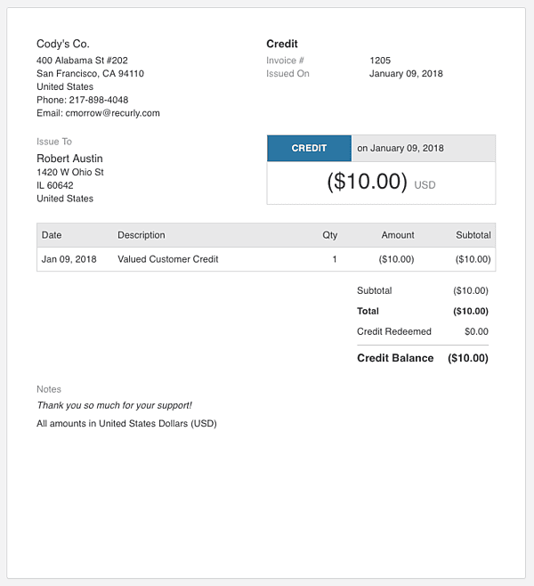
Finally, but perhaps most importantly, we put a renewed focus on testing our ideas and solutions with users. We tested multiple aspects of the upcoming Credit Invoices feature with users, which gave us an opportunity to incorporate feedback into the invoice and refund flows, as well as the general invoice and email design.
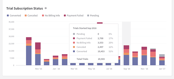
Testing our new Trial Performance Analytics allowed us to confirm that we were representing data in a useful way, as well as learn about features users would like to see in the next version.
2017 in Review
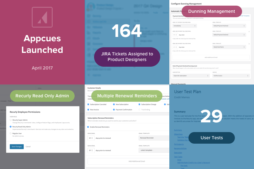
We put together a visualization of everything we did last year. Click here to check it out. And stay tuned for even more improvements this year!
TOPICS
