

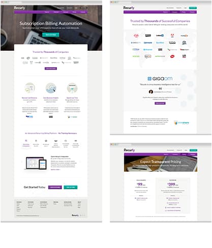
As you may have noticed, some changes have been happening to recurly.com. Over the past 6 months we have been working to give our website a much-needed refresh. We started with the home page, which served as a jumping-off point to begin introducing a new design and structure to our website. So far these updates have been carried over from the Home Page to our Customers, Case Studies, Gateways, and Pricing pages.
Features Icons
Currently, we’re working on the redesign of our Features section. One of the major goals of this redesign is to better organize the content so that visitors can easily learn about the features Recurly has to offer. In doing so, we’ve introduced a set of icons that correspond to each of the subsections within Features. These icons serve as a great addition to our updated wayfinding experience while also bringing some added visual interest to the pages.
Iconography has already been introduced into some of the newly redesigned pages on our website. We’ve been using the Morphix Design Studio’s icon set Picons because it fits the new look and feel we are moving towards and also offers a wide variety of icon options, along with a web-font version.

Because of this, one of the goals for the Features section icons is for the icons to compliment the style of the Picons set. In fact, some of these new icons incorporate and expand upon shapes taken from within the Picons set.
The Rules
In order to create a cohesive set of icons, it is important to establish a set of guidelines for each icon to follow. Setting up these rules helps to ensure that the resulting set will not only speak to each of the Features subsections specifically, but will also work together as a whole collection.
For this exercise, those main parameters relate to color, shape, and complexity:
Color
the primary color in each icon is white
each icon has either two or three colors incorporated
the colors come from the recurly color palette and are limited to white, two neutrals (a light and a dark), blue, and orange
all of the icons share the same background color

Shape
no element extends beyond the circle or breaks the visual barrier
elements within the circle are mostly angular in shape to maintain a solid, professional feel

Complexity
elements aren’t overly complicated visually
each icon holds a similar visual weight to the others in the set
icons can be read at both a large and small scale

Sneak Peek
We can’t wait to release the entire Features section redesign to you, but for now we’ll give you a sneak peek at the new structure along with the entire set of icons that accompany it. The section will be divided into 4 major pages: Quick Setup, Subscriptions, Billing Management, and Powerful Results.

This project is still a work in progress and as is the case with all of the designs we work on, will be revisited and reworked as time goes on. We hope this has given you a taste of what’s to come, and are looking forward to finishing the entire Features section redesign and sharing with you (soon!) how these icons fit into the overall design.
TOPICS